Overview
Overview answers “what did the traffic look like, and who made most of it?” for the range in the controls bar. It is the only page that shows something as soon as it opens: the graph reads the stored series and the top lists come from data the import already collected, so nothing waits for a query.
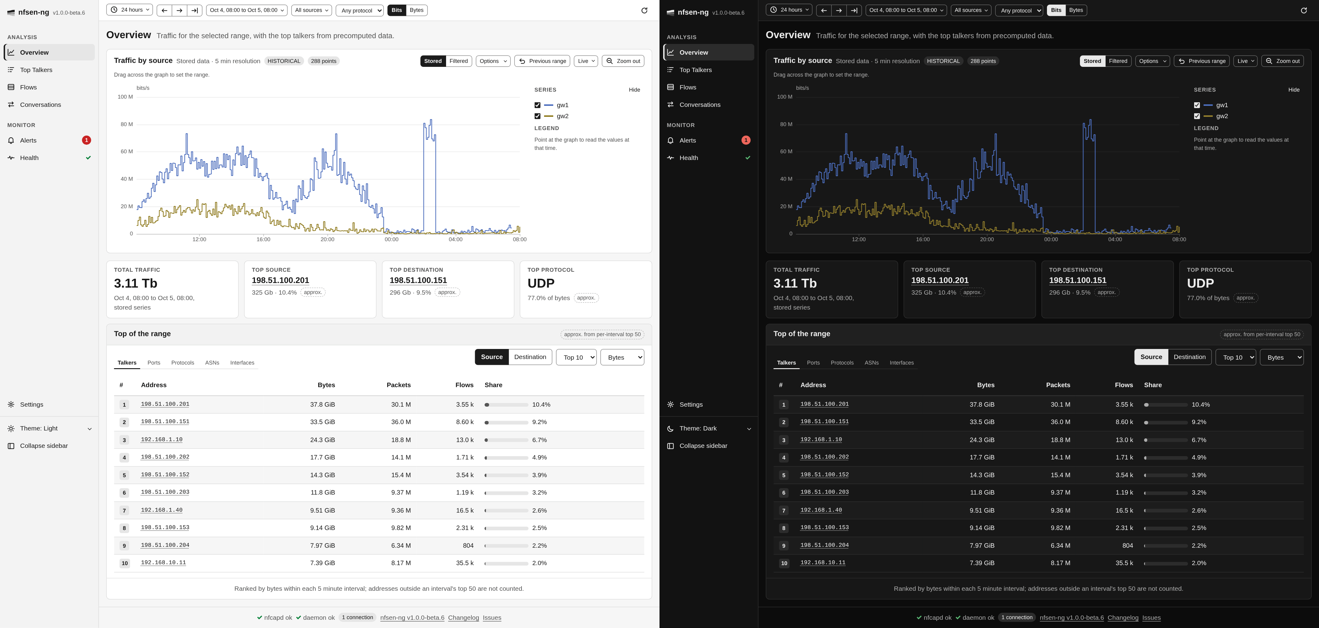
Reading the graph
The title says what is plotted (Traffic by source, Packets by protocol, …), and the line next to it which data: Stored data · 5 min resolution for the series the import writes, Filtered data for a graph built through a filter (see below). A LIVE badge with the time of the last update means the window follows the newest data; HISTORICAL means it stays where it is. The last badge counts the data points.
The panel beside the graph has two lists. Series has a checkbox with the line’s colour for every series, to hide the ones in the way. Legend shows the values at the time you point at, largest first. Hide folds the panel away. Pointing at a line lifts it and fades the rest.
The graph also sets the time range for every page: drag across it. The Quick Tour describes the zoom, preview and Live controls in its header.
Choosing what to plot
Options in the graph header opens the settings of this graph:

| Control | What it does |
|---|---|
| Display by | Sources (one line per exporter), Protocols (TCP, UDP, ICMP, Other) or Ports (one line per tracked port you pick) |
| Data type | Traffic, Packets or Flows |
| Resolution | How many points to draw, from 50 to 2000 |
| Scale | Linear or Log |
| Style | Stacked areas or single Lines |
| Line | Step or Curve |
The sources, the protocol and the unit (bits or bytes) come from the controls bar and apply here too. The protocol there narrows the Sources and Ports displays; the Protocols display always shows all four protocols and says so. Scale, Style and Line only change the drawing and are remembered by this browser.
Graphing what a filter matches
The stored series hold totals per source, protocol and port, so there is nothing in them to narrow down by address after the fact. Switch the Stored and Filtered toggle in the graph header to Filtered to plot any nfdump filter instead: nfsen-ng then re-reads the capture files, one nfdump run per point, several at a time.
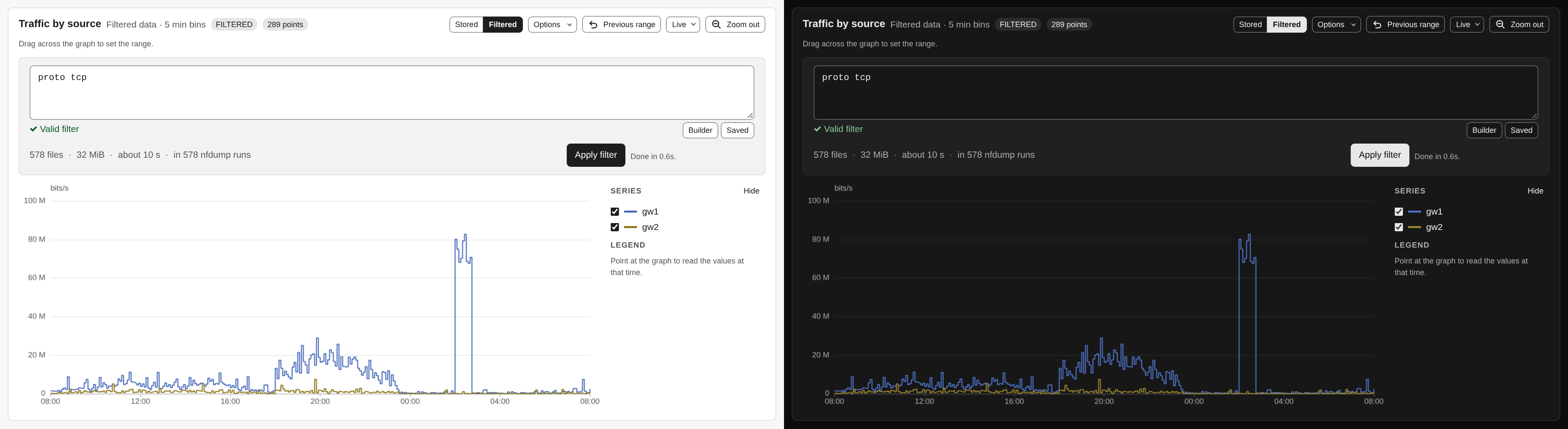
That reads capture files, so it never runs on its own. Type the filter (the field says whether nfdump accepts it), check the estimate next to it, and press Apply filter. An empty filter graphs all traffic. The button shows progress and the time left, and Kill stops the build at once, keeping the points it has. The graph then says FILTERED and does not refresh itself. The Ports display is not available in this mode, because the filter already is the port selection. Narrow the range first; the window width, not the number of points, decides how long a build takes.
To see a filter as a timeline and as individual records, filter on Flows and open Traffic over time there.
Key figures
Four cards sit under the graph:
- Total traffic in the range, from the stored series, in the unit of the controls bar.
- Top source and Top destination, the busiest addresses with their volume and share of bytes. Click an address to look it up.
- Top protocol with its share of bytes.
The three top cards come from the precomputed lists described below and carry an approx. badge. Instead of a figure they can say Computing, Collecting (nothing collected yet), Outside the 31 day window, or Top-N disabled.
Top of the range
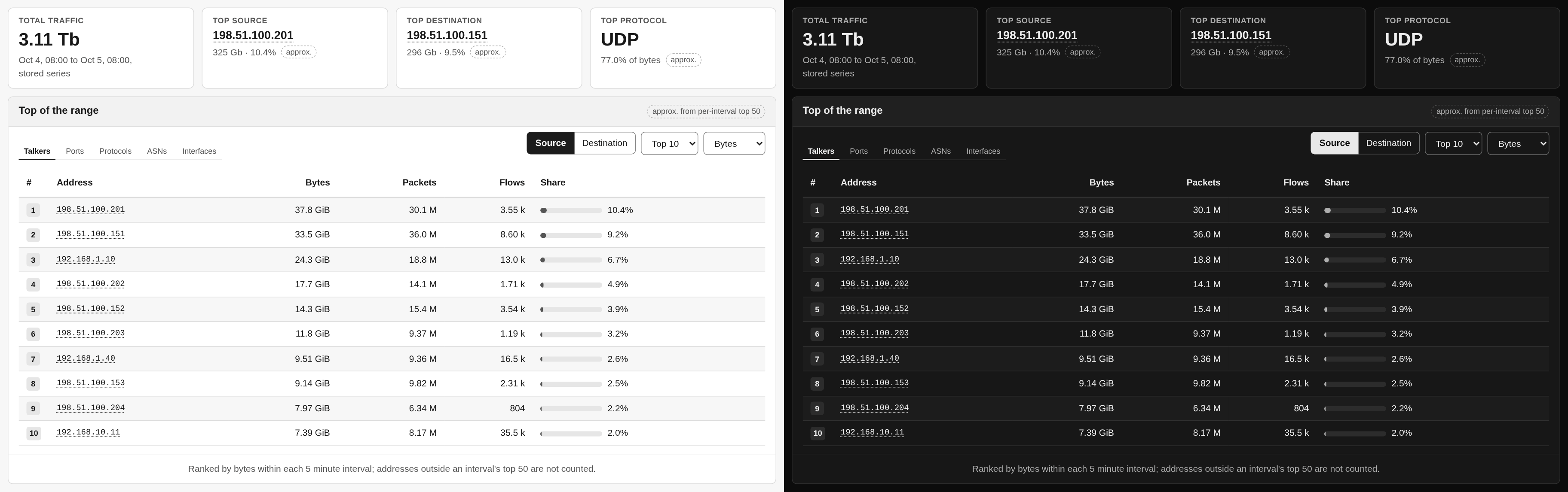
The card under the key figures ranks the busiest keys of the range, one tab each for Talkers (addresses), Ports, Protocols, ASNs and Interfaces. Next to the tabs you choose Source or Destination (In or Out for interfaces; protocols have no direction), Top 10, 20 or 50, and the order: Bytes, Packets or Flows. Each row shows bytes, packets, flows and its share of the range’s bytes. Click an address to look it up.
The lists are approximate, and the card says so. While importing, nfsen-ng stores the top 50 of every statistic for each five-minute capture file, and the card adds these up over the range. A key that never made an interval’s top 50 is not counted, so a host that is always 51st is missing. The footer of the card repeats this rule, says when the stored intervals cover less than 95 % of the range, and, while a protocol is selected in the controls bar, that the protocol does not narrow these lists. The intervals are ranked by bytes, so ordering by packets or flows is labelled ranked by bytes per interval. For ranges up to six hours an In top 50 column says in how many intervals each key made the list.
The rank numbers take a graph colour only when the row is a line in the graph above: protocols while the graph shows the Protocols display, and ports while it shows those ports. Everything else stays neutral.
Ranges outside the stored lists
The lists reach back as far as the administrator configured, 31 days by default
(NFSEN_TOPN_RETENTION_DAYS). For a range that starts earlier, or when
collection is off, the card offers Run exact query instead: the same list
computed by nfdump from the capture files, with the usual estimate before you
press it. The result is labelled Exact (nfdump) with the command it ran, and
its share column is nfdump’s own share of the bytes in the capture files it read.
Those can be fewer than the stored graph covers, because capture files are often
kept for less time than the series.
What’s next
Once you spot something on the graph, drag across it to narrow the range, then open Top Talkers for exact rankings of that window, Flows for the records themselves, or Conversations to see who talked to whom.