Sankey Diagram
In development — the Sankey tab is still being built out (tracked as issue #152); expect rough edges.
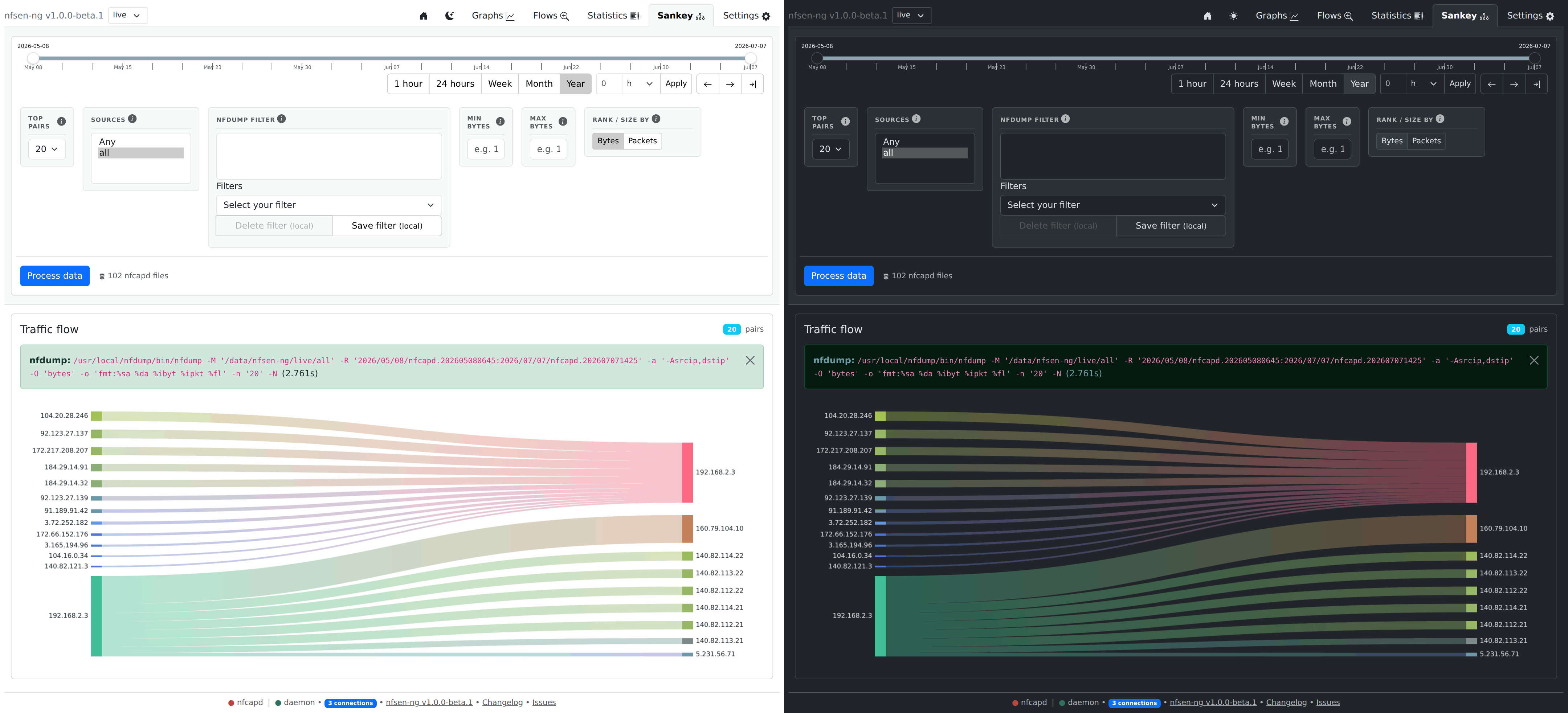
The Sankey tab visualizes who talks to whom: each band is a source→destination pair, sized by bytes or packets, so the biggest conversations are immediately obvious as the widest bands.
When to reach for this instead of Statistics
Statistics ranks addresses independently — “top 10 source IPs” and “top 10 destination IPs” are two separate lists. Sankey shows the relationship between them in one picture: which sources are driving traffic to which destinations, at a glance, without cross-referencing two tables yourself.
Running a query
Same pattern as Flows and Statistics: set your date range and filters, click Process data. The extra control here is Rank / size by — Bytes or Packets — which decides how wide each band is drawn. Top pairs caps how many source→destination pairs appear; past a certain count the diagram gets crowded rather than more useful, so start small (10–20) and widen only if you need to.
Filters (sources, nfdump filter expression, min/max bytes) work the same as every other data tab.
Adding the port dimension
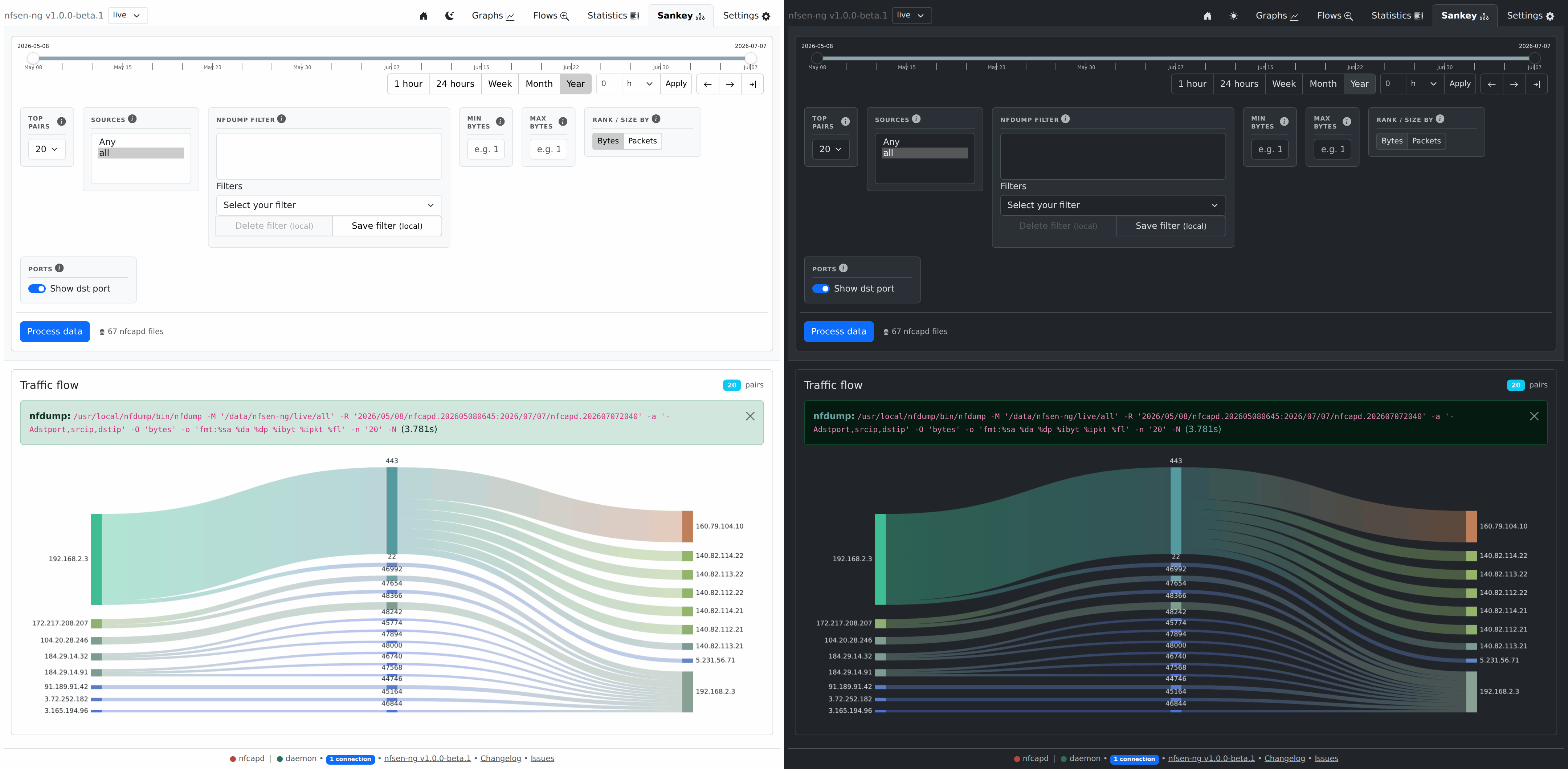
Flip on Ports (Show dst port) to slot the destination L4 port between the
two IP columns: src IP → dst port → dst IP. This answers what service a
conversation is using, not just who talks to whom — e.g. seeing that one host’s
traffic to a server is all 443 while another host’s is 22. The middle
column pools traffic per port, so a busy port like 443 shows up as one thick
node fed by every source and fanning out to every destination that used it.
Because the port joins the aggregation key, Top pairs now caps src/port/dst
tuples rather than plain pairs, so bump it up a little if a busy port thins out
the view.