The Dashboard
The Graphs tab is a live time-series chart of your traffic — the first thing you see, and the one tab that updates itself without you clicking anything.
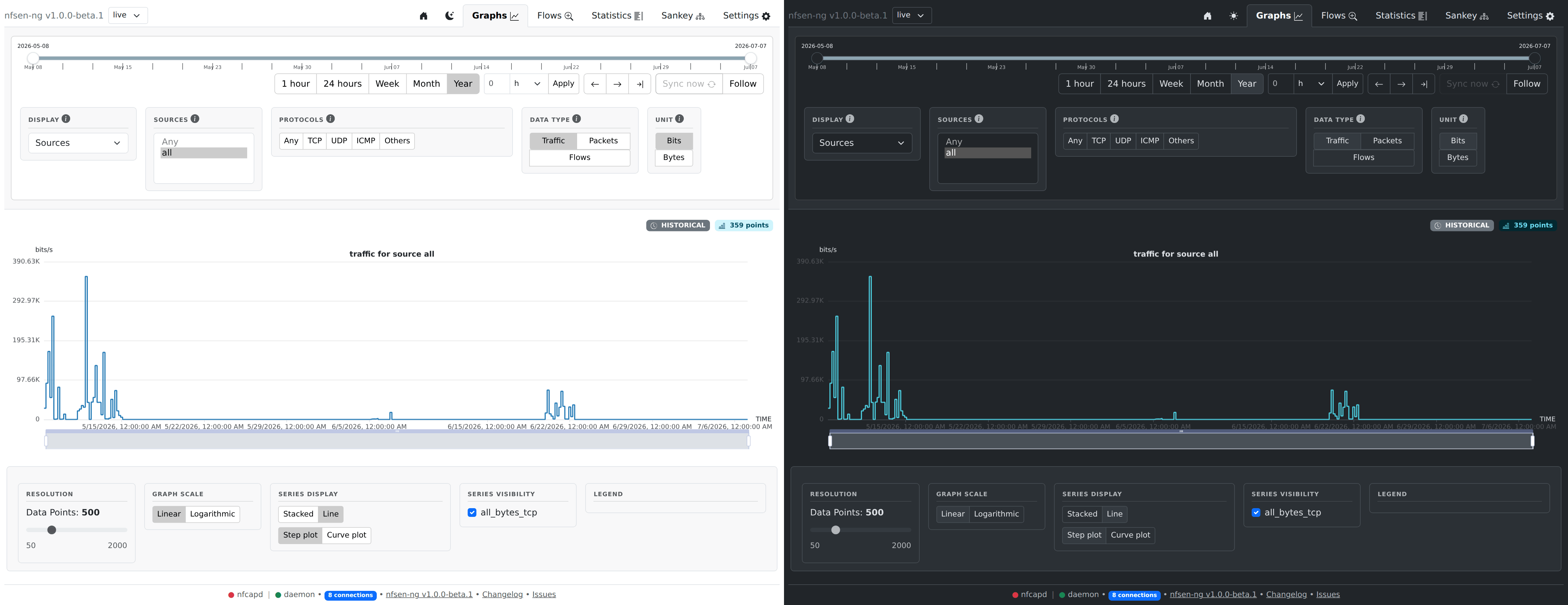
Reading the chart
The chart title (“traffic for source all”) and the LIVE badge above it tell you what’s plotted and confirm you’re looking at current data — the timestamp next to it is the last time new data arrived. As new nfcapd files land, the chart extends itself automatically; no refresh needed.
Choosing what to plot
The filter panel above the chart controls what you see:
| Control | What it does |
|---|---|
| Display | Group the chart by Sources (one line per exporter), Protocols (one line per protocol), or Ports (one line per tracked port) |
| Sources | Which exporter(s) to include — pick specific ones, or all |
| Protocols | Filter to TCP / UDP / ICMP / Others, or Any |
| Data type | Traffic (bytes), Packets, or Flows |
| Unit | Bits or Bytes (only applies to Traffic) |
Below the chart, a few display-only controls let you adjust how it’s rendered without re-querying anything: number of data points (resolution vs. render cost), linear vs. logarithmic scale, stacked vs. line series, and step vs. curve interpolation.
Zooming in
Drag across the chart itself to zoom into a specific window — the date range slider above updates to match. Use the slider’s ←/→ buttons or drag its handles to move the window instead of re-selecting on the chart every time.
What’s next
Once you spot something interesting on the graph — a spike, an unfamiliar protocol share — the natural next step is Browsing Flows or Statistics for the same time window, to see exactly which conversations made up that traffic.